EMAIL DESIGN
I have over three years of experience working with brands in conceptualizing and creating unique design assets for their email strategy. Always making sure designs are optimized, innovative and an extension of the brand. (conceptualizing, design, animation)


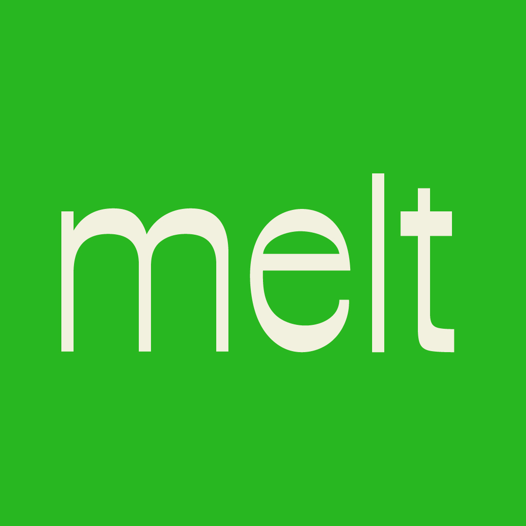
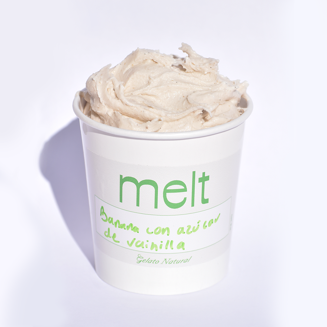
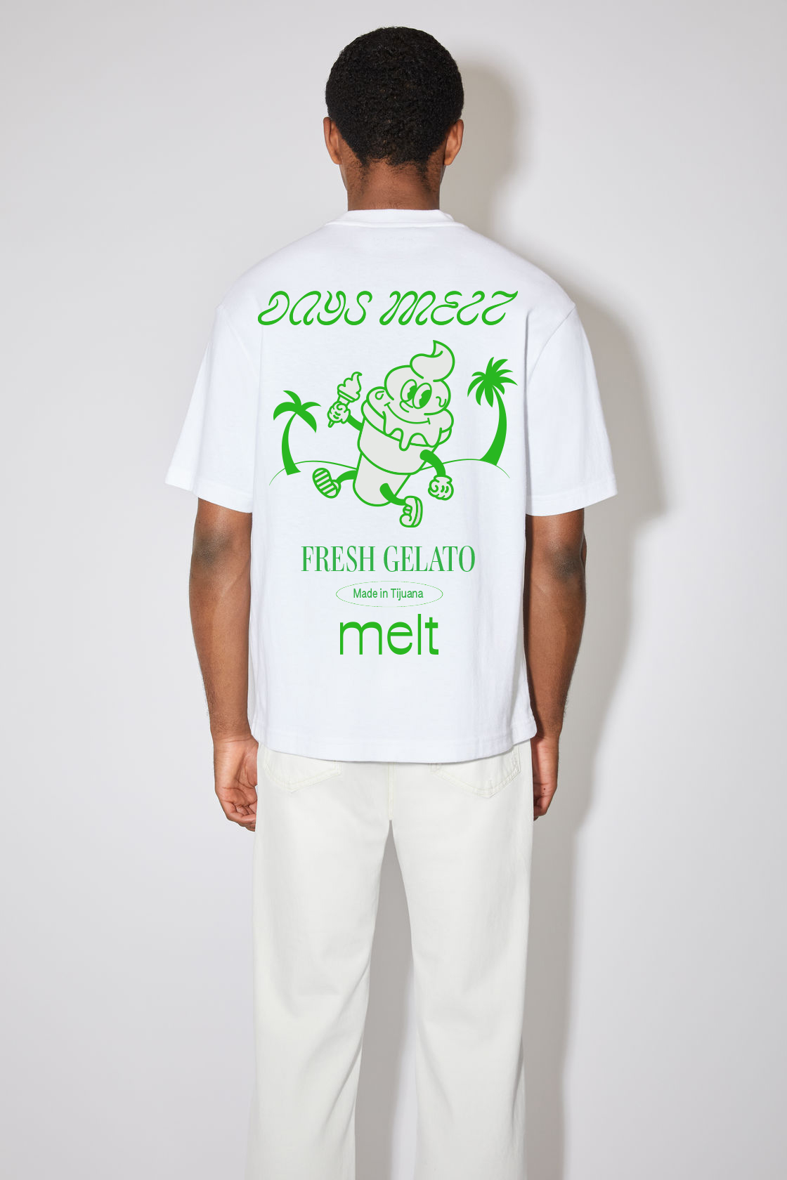
MELT
Melt is not your ordinary gelato place. Melt is a fresh gelato place from Tijuana focused on the pint game. Each month they come up with a new flavor. They are dynamic, experimental, fresh and playful and the challenge was to create an identity that reflected that.
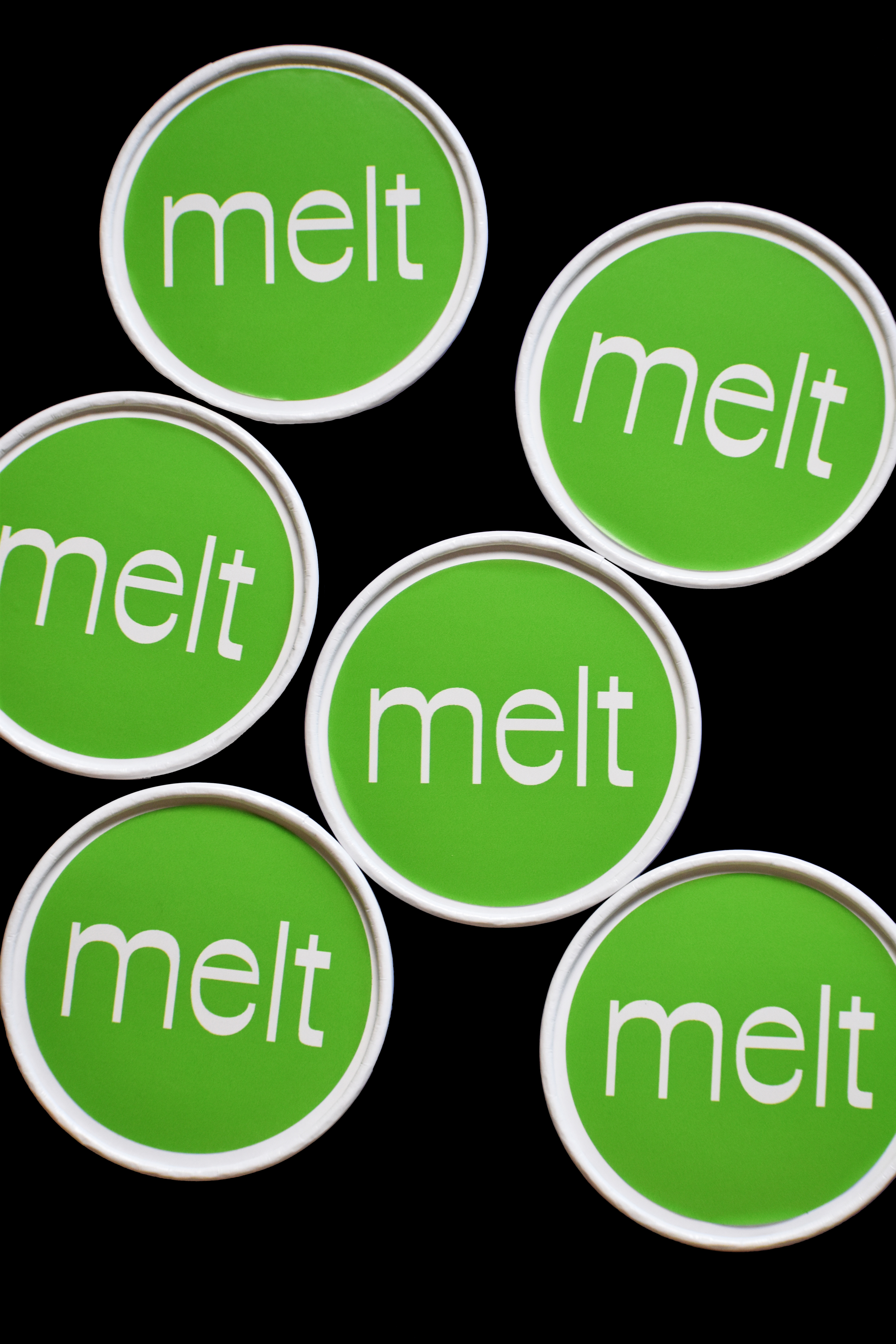


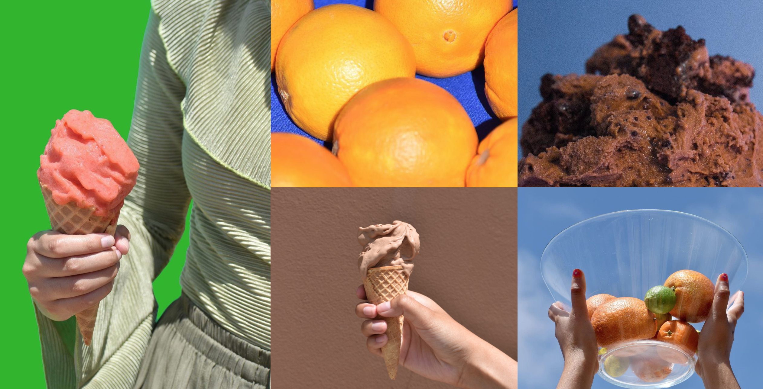
The experimental Melt pint. These are used whenever they want to experiment with a new flavor and want to do short test runs.
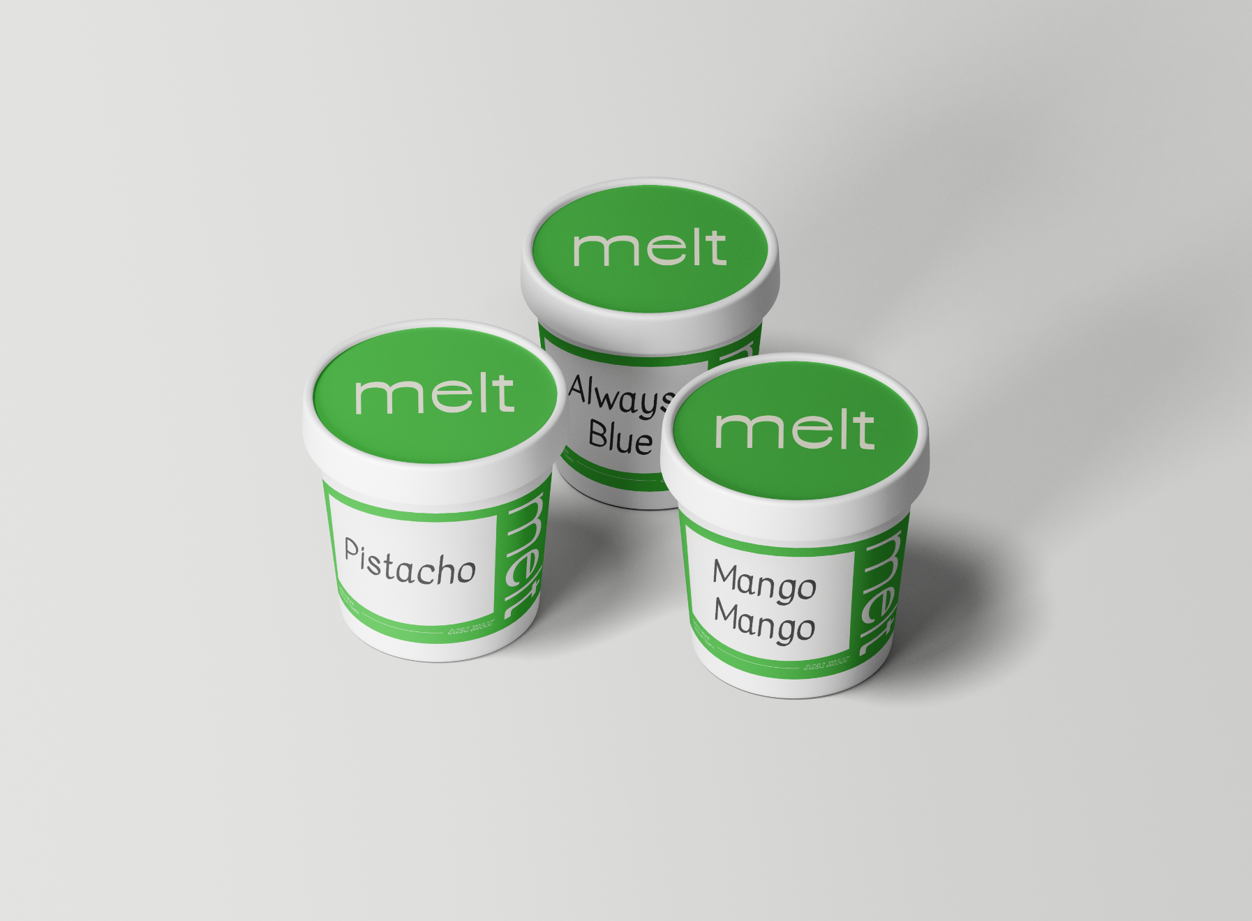
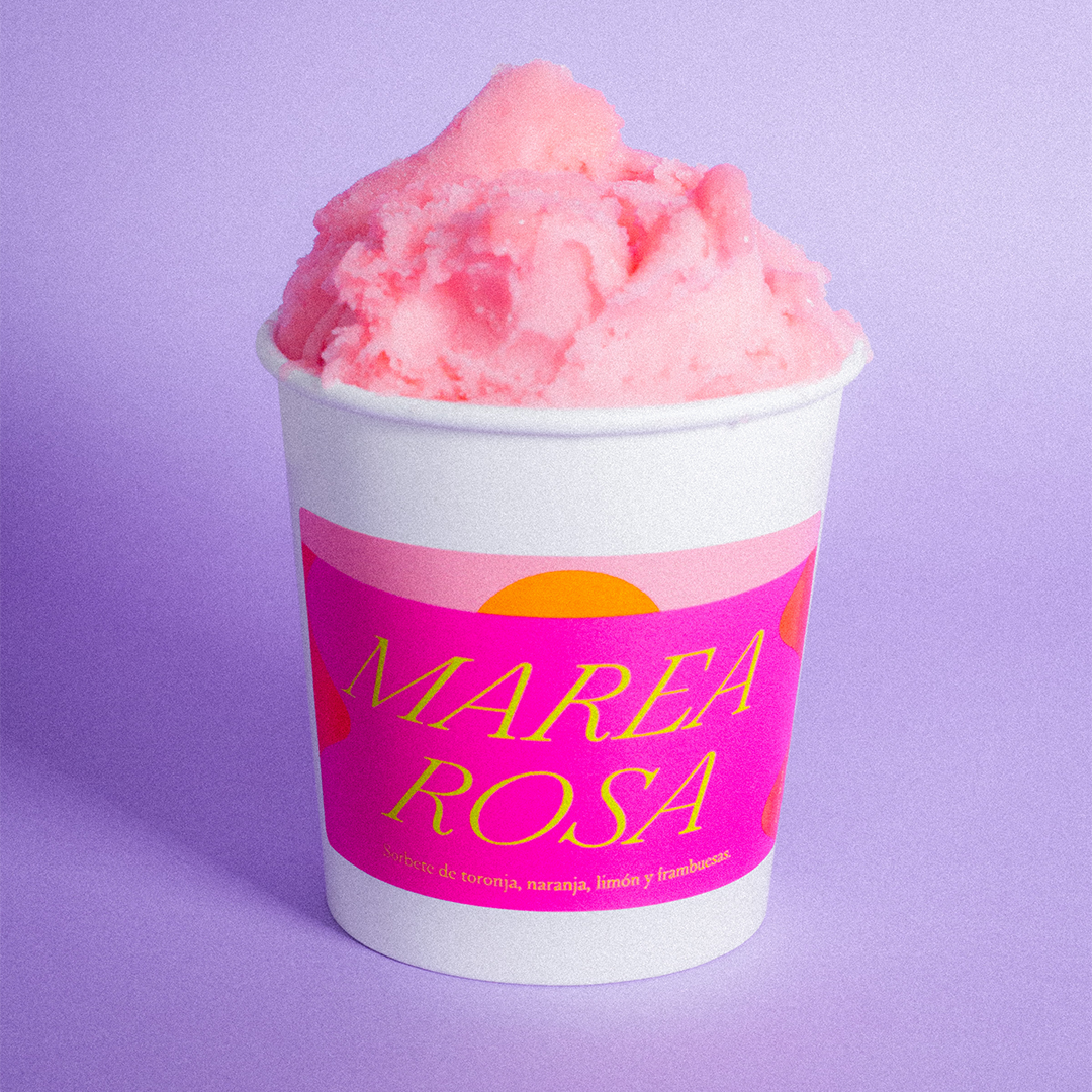
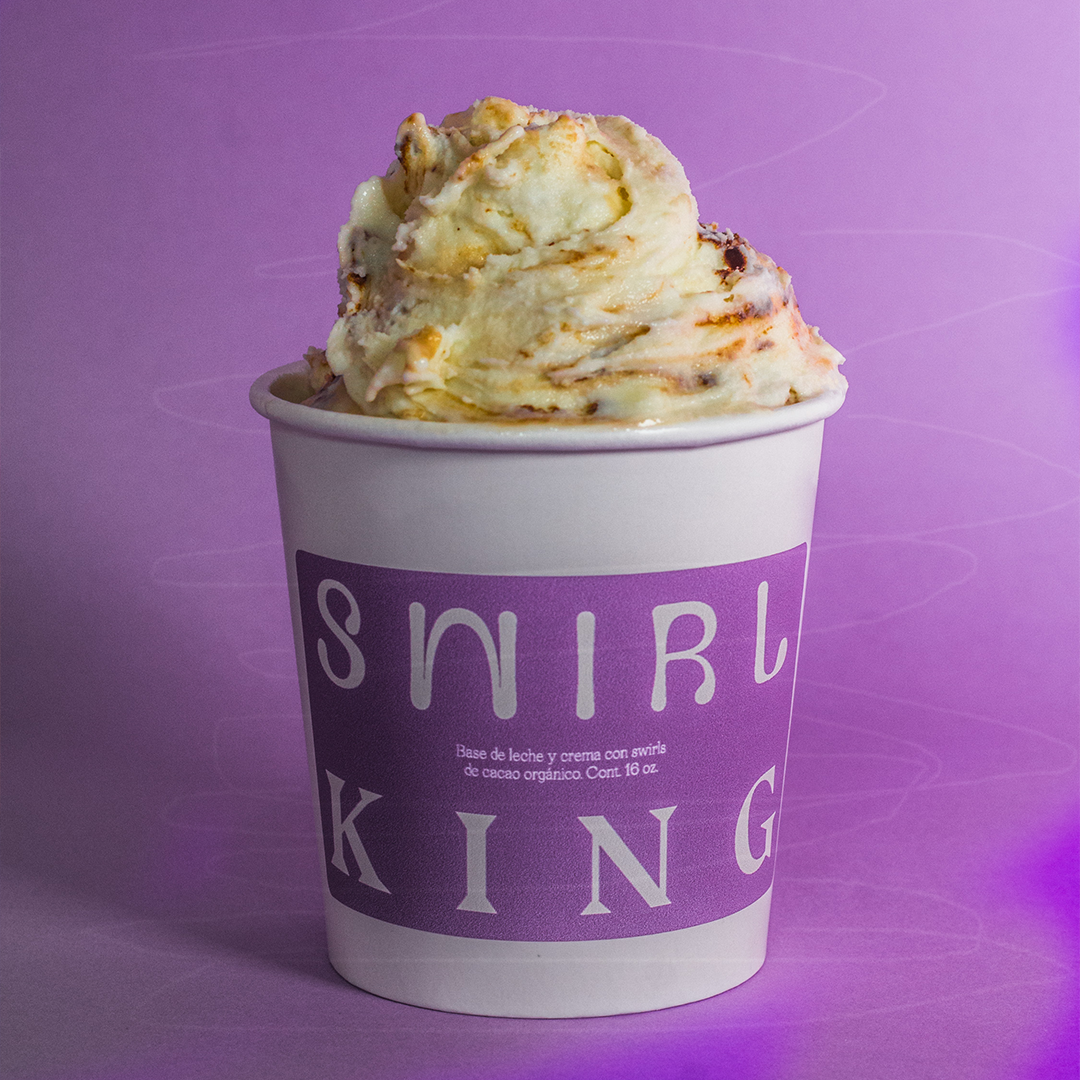
If a flavor is here to stay, they get their own label. We created a unique label for each flavor in order to showcase their personality in a more playful way.


Follow them on instagram: @melt.gelato
LO DE ADENTRO IMPORTA
Lo de Adentro Importa is a podcast hosted by Lety Sahagún and Ashley Frangie. Every week they discuss with experts about the environment, so we can all be more informed and learn ways we can be more gentile with our planet. We ended up creating a vibrant, organic and educative design made to help listeners to understand these important issues.
Youtube channel

Instagram Stories

Guests
![]()
![]()
DESPERTANDO PODCAST
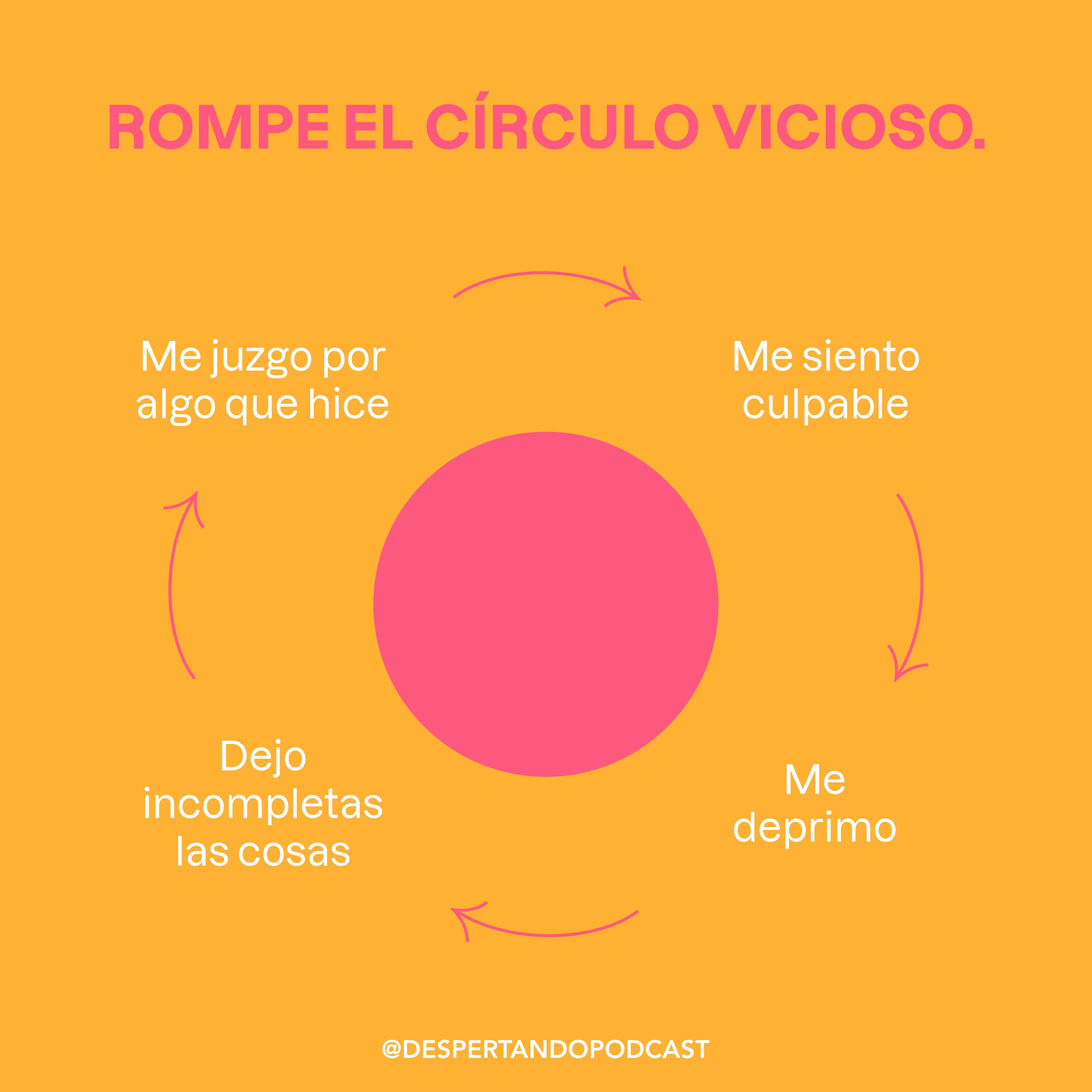
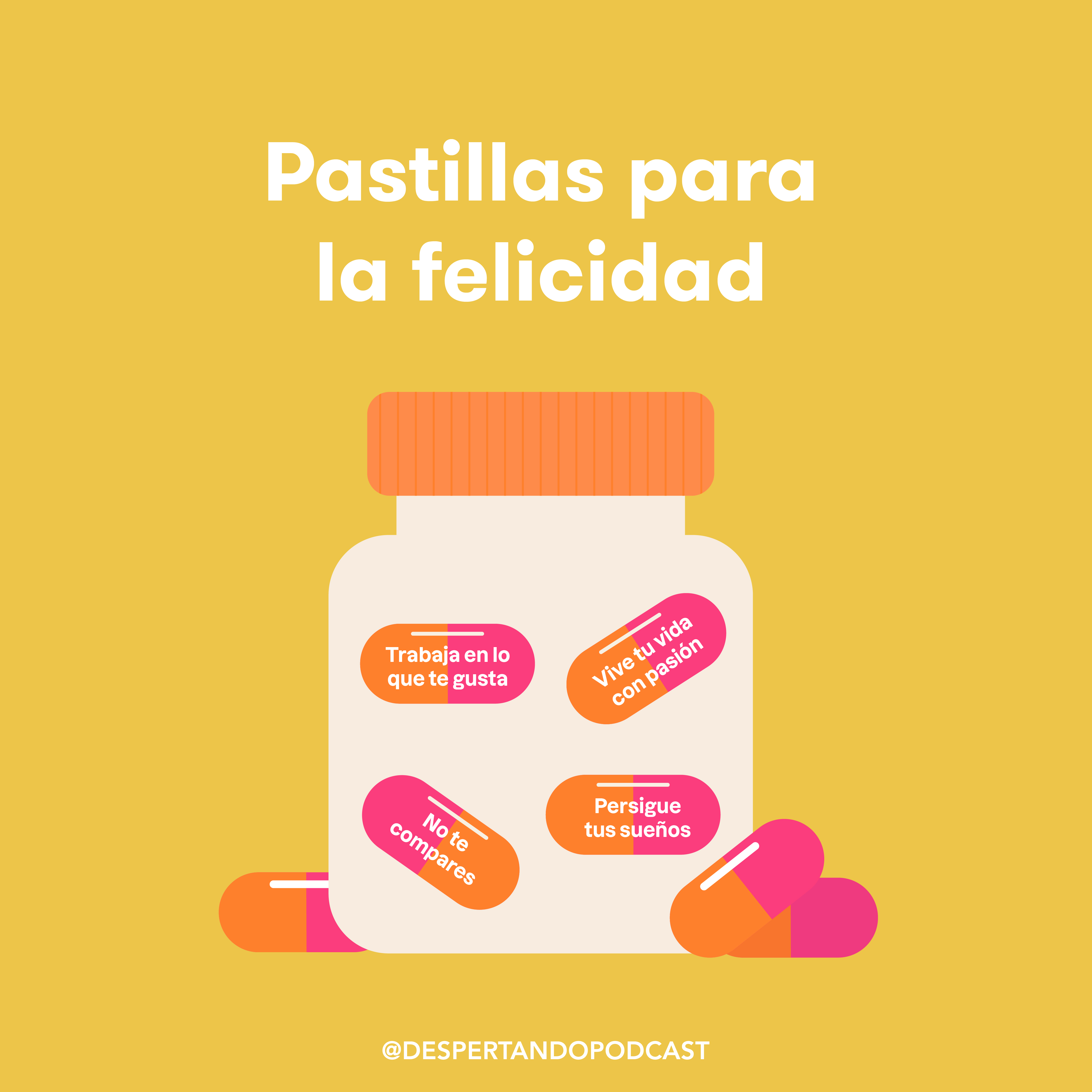
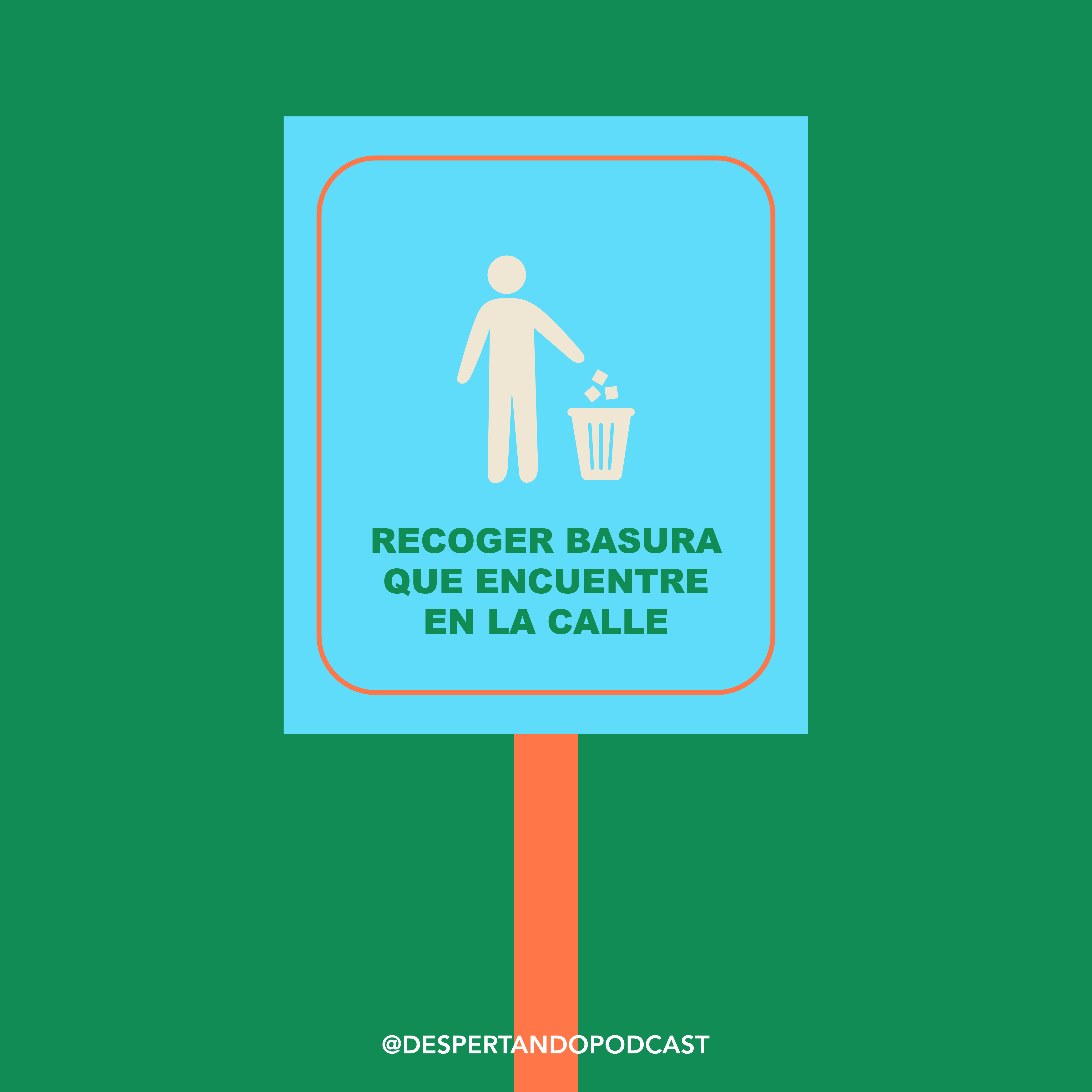
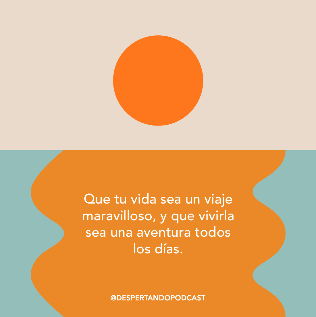
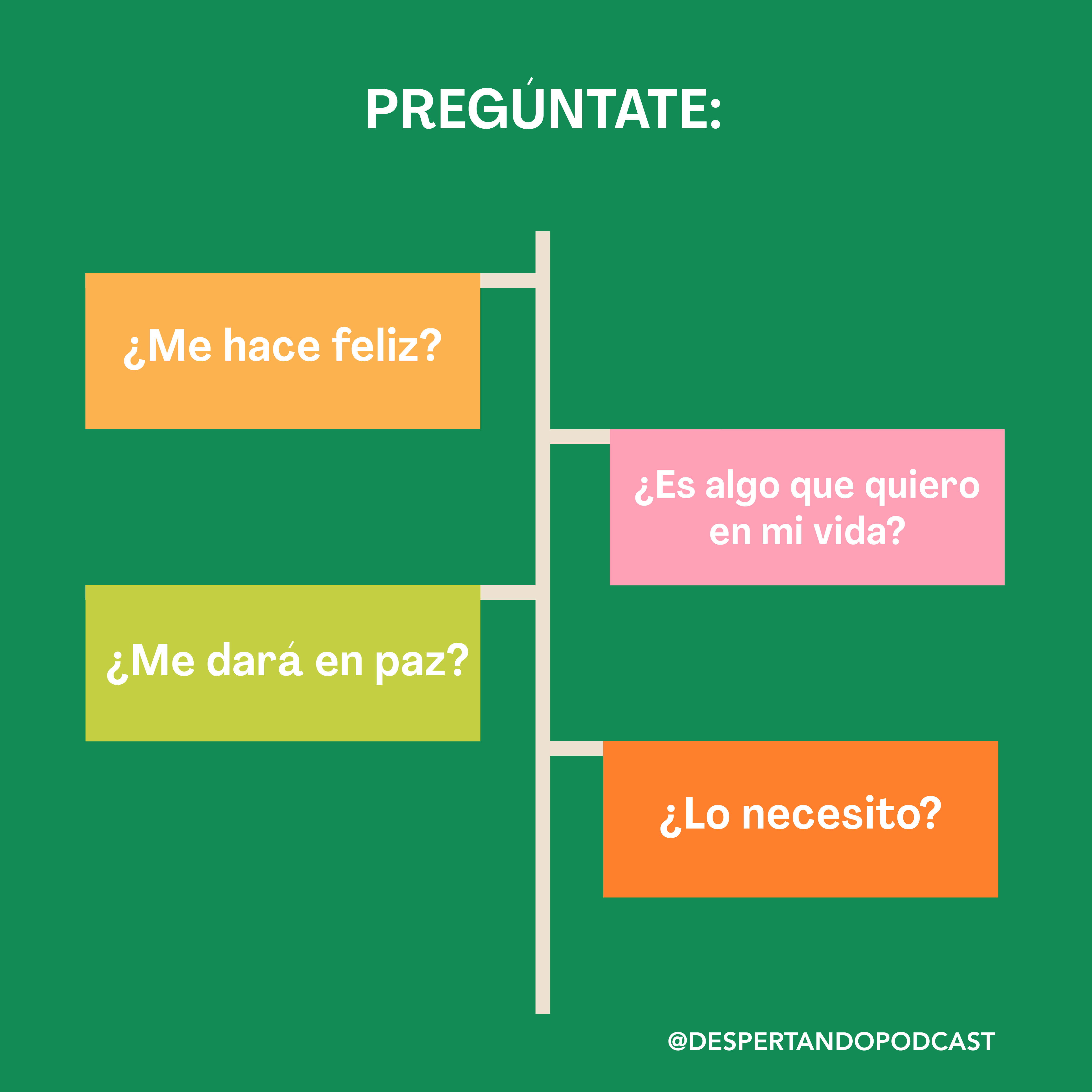
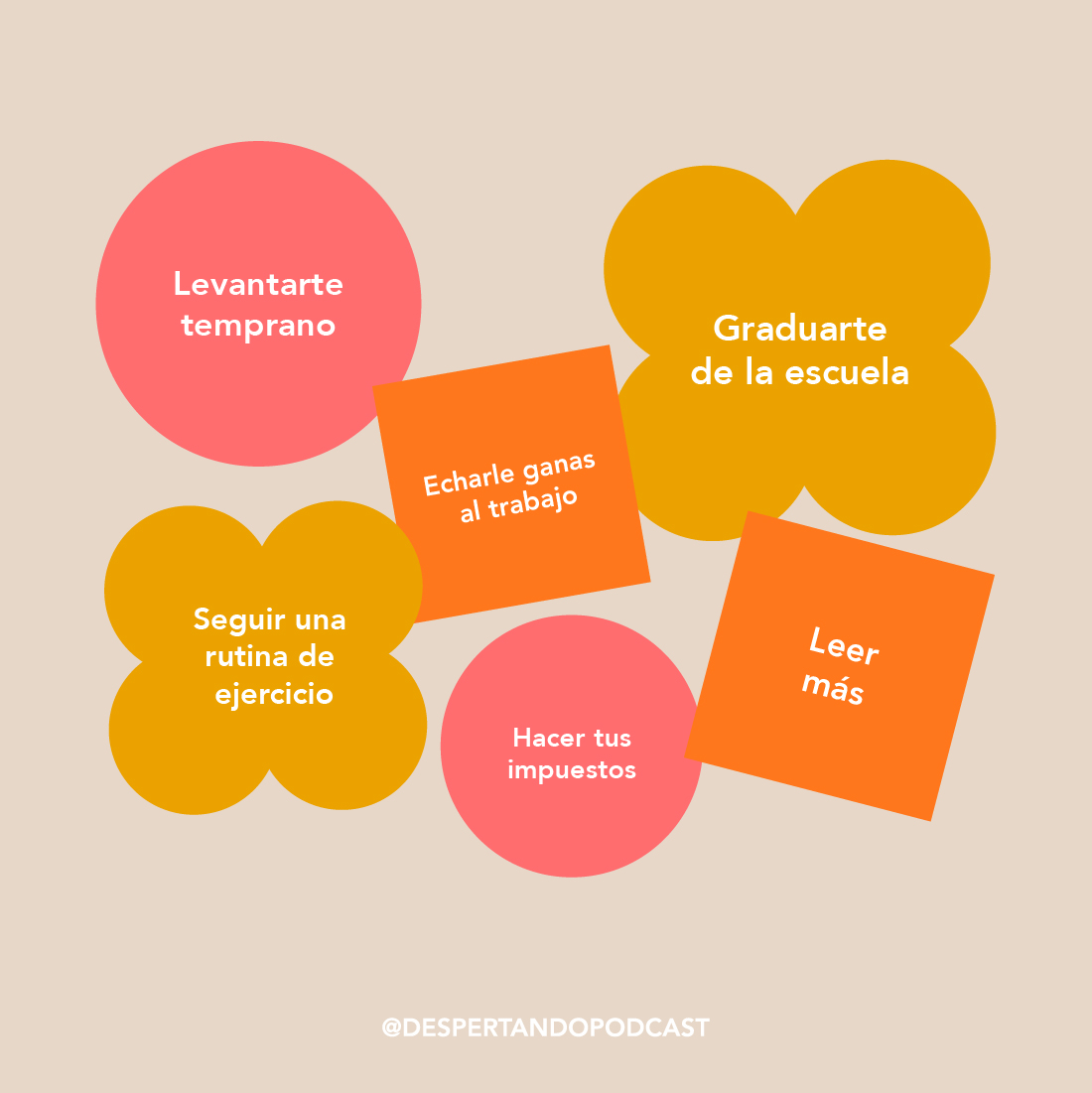
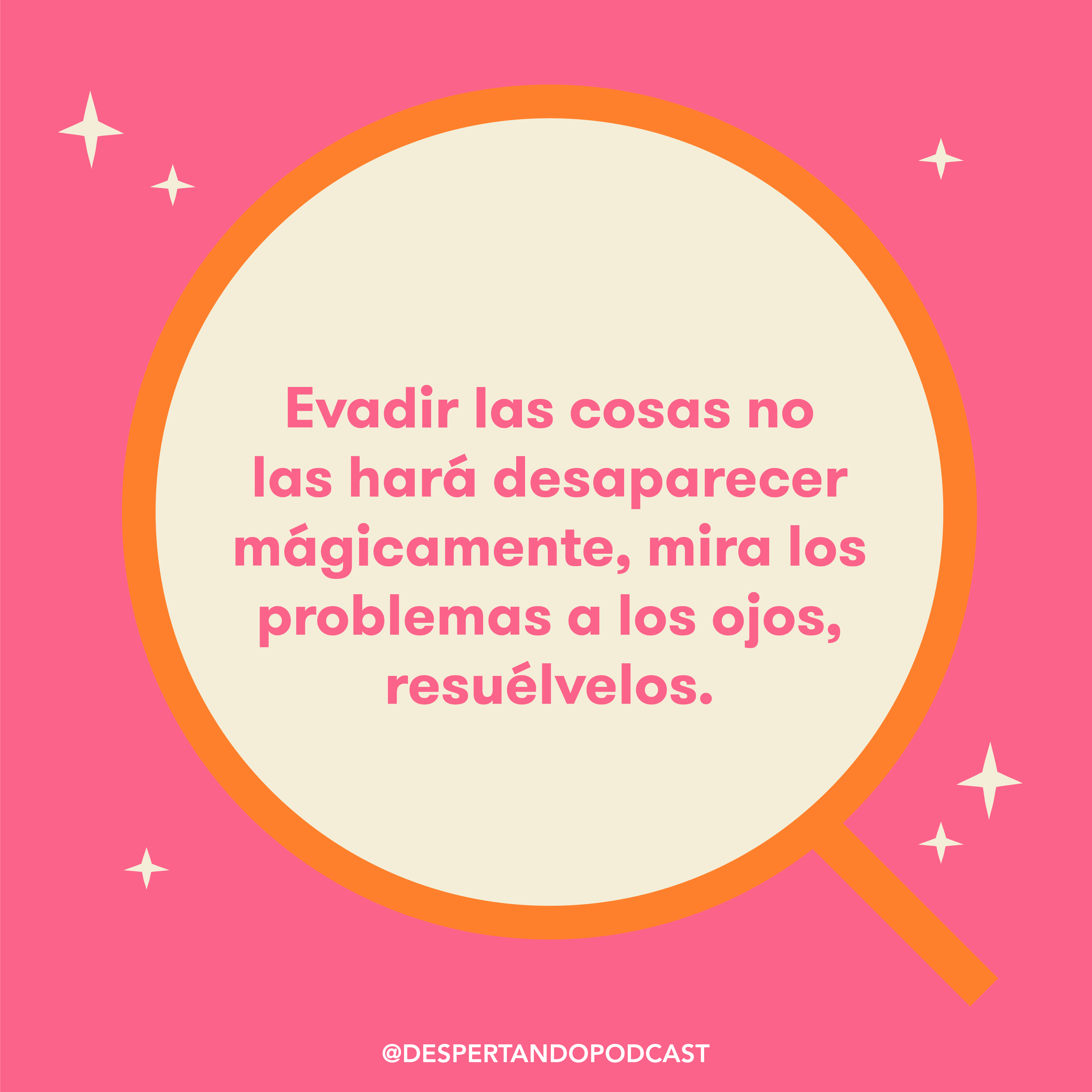
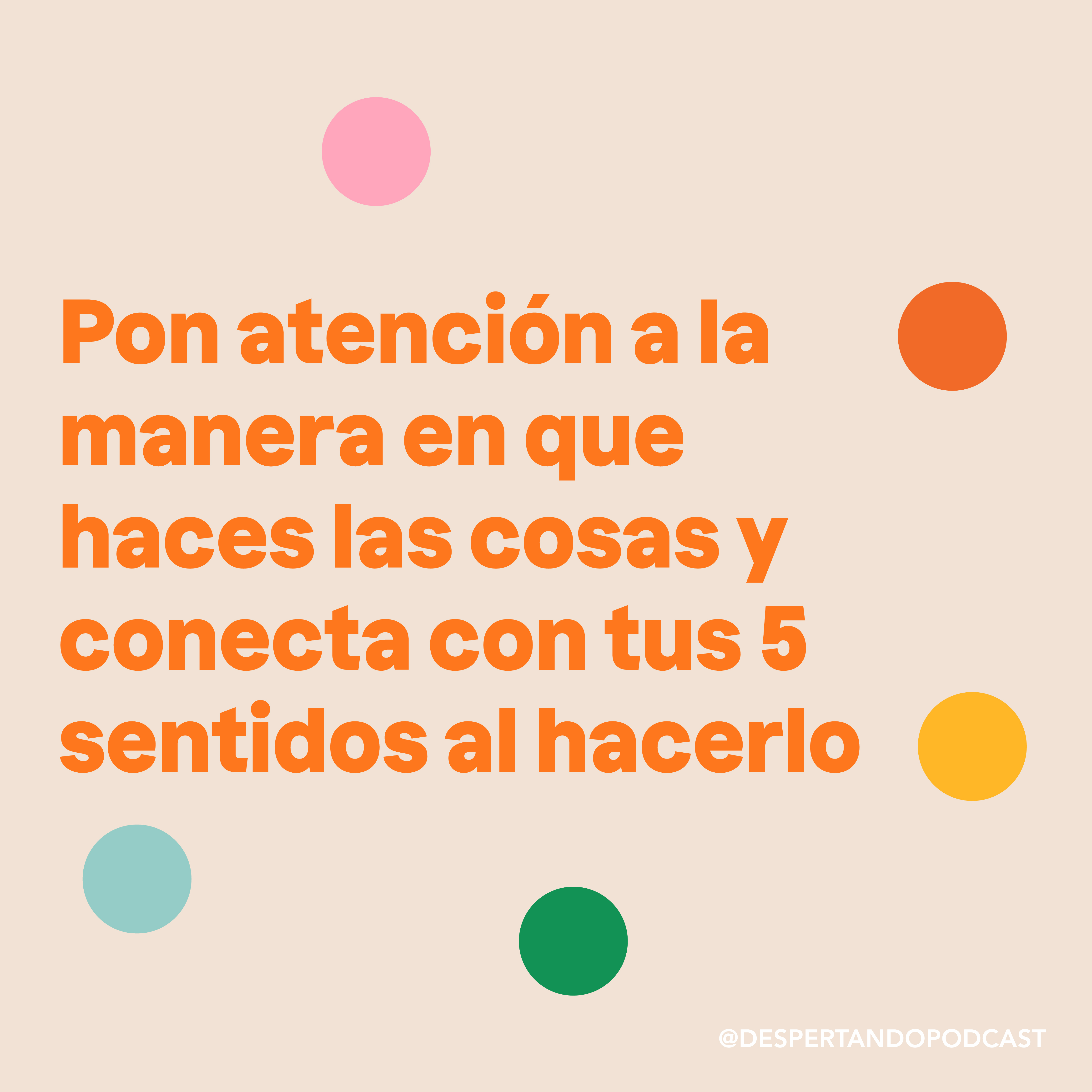
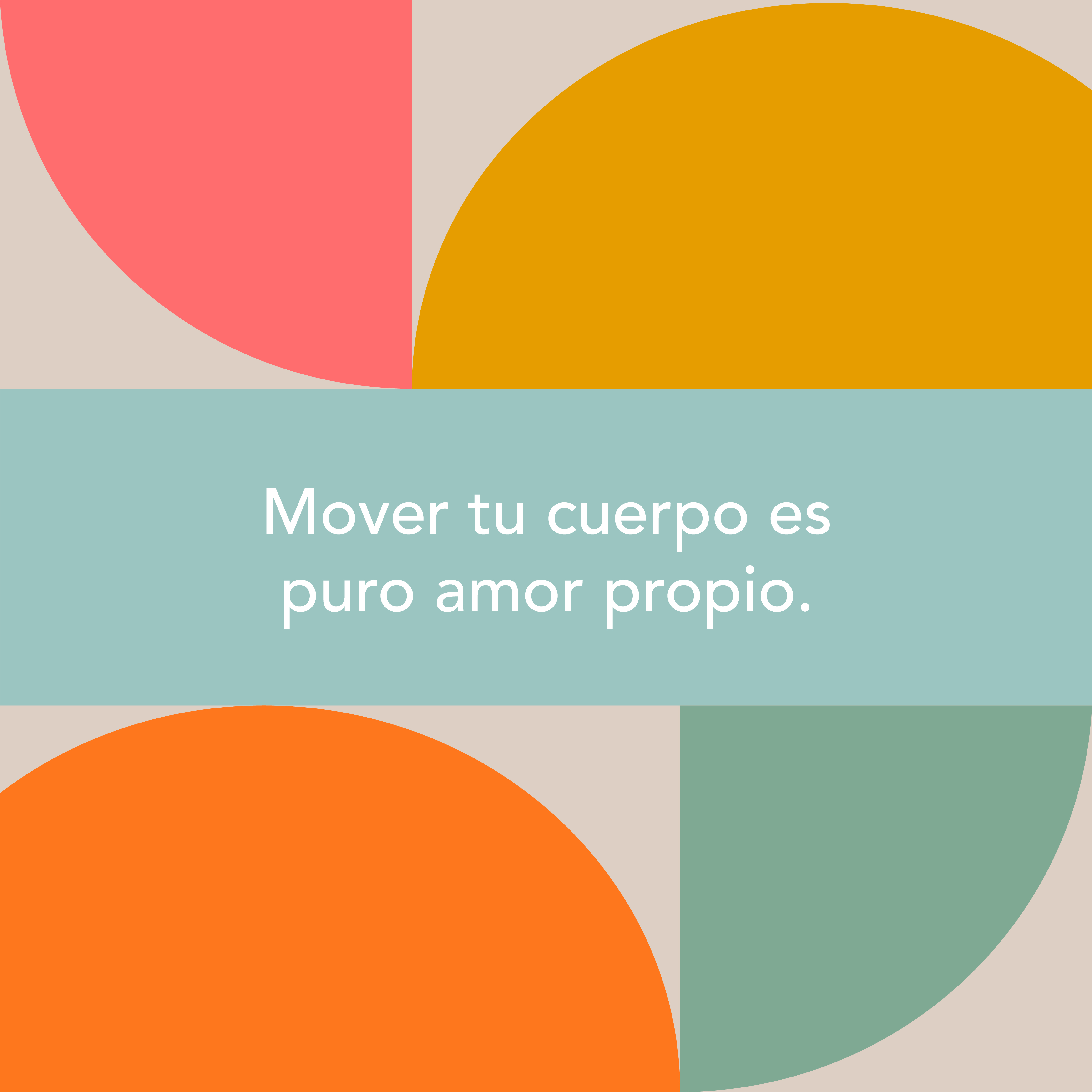
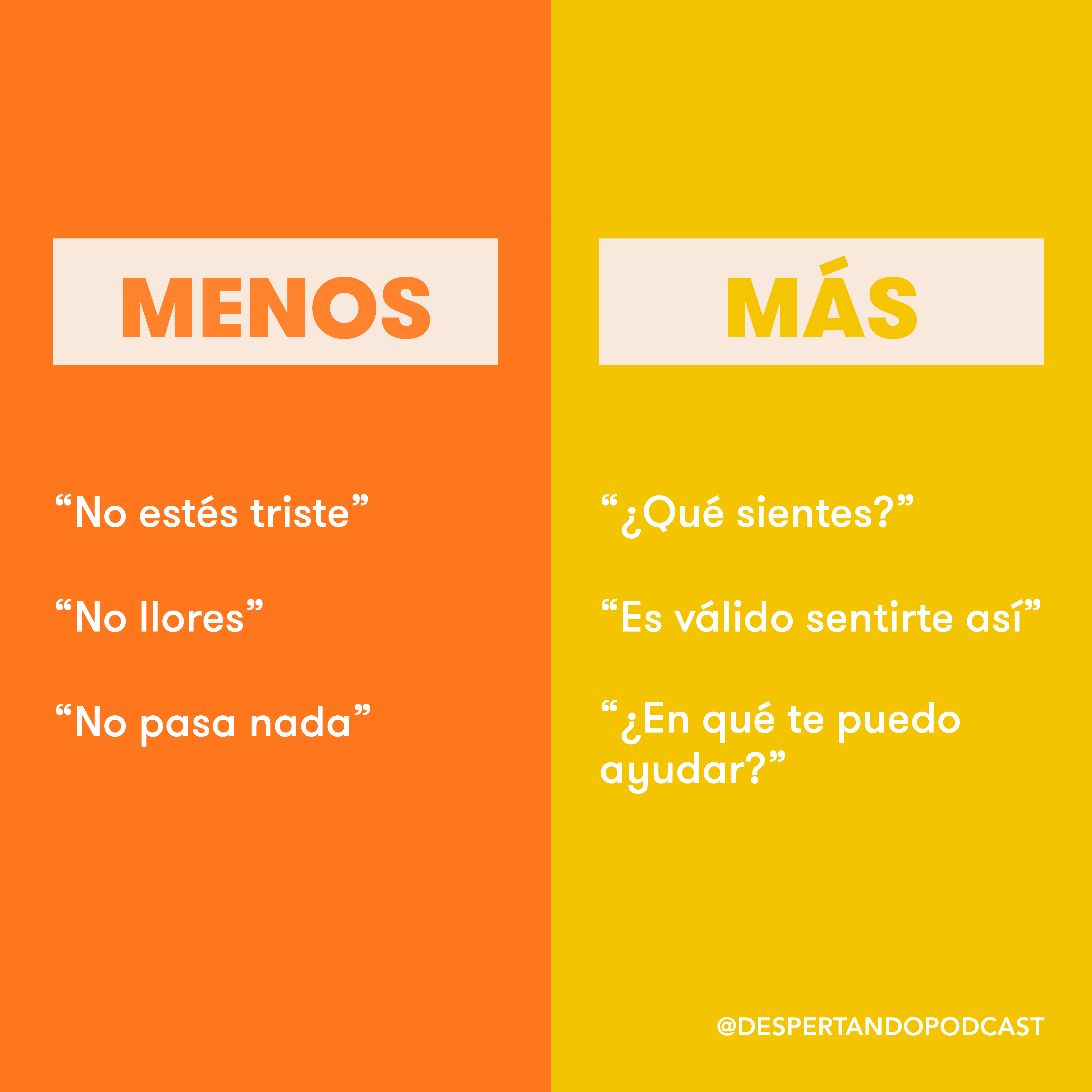
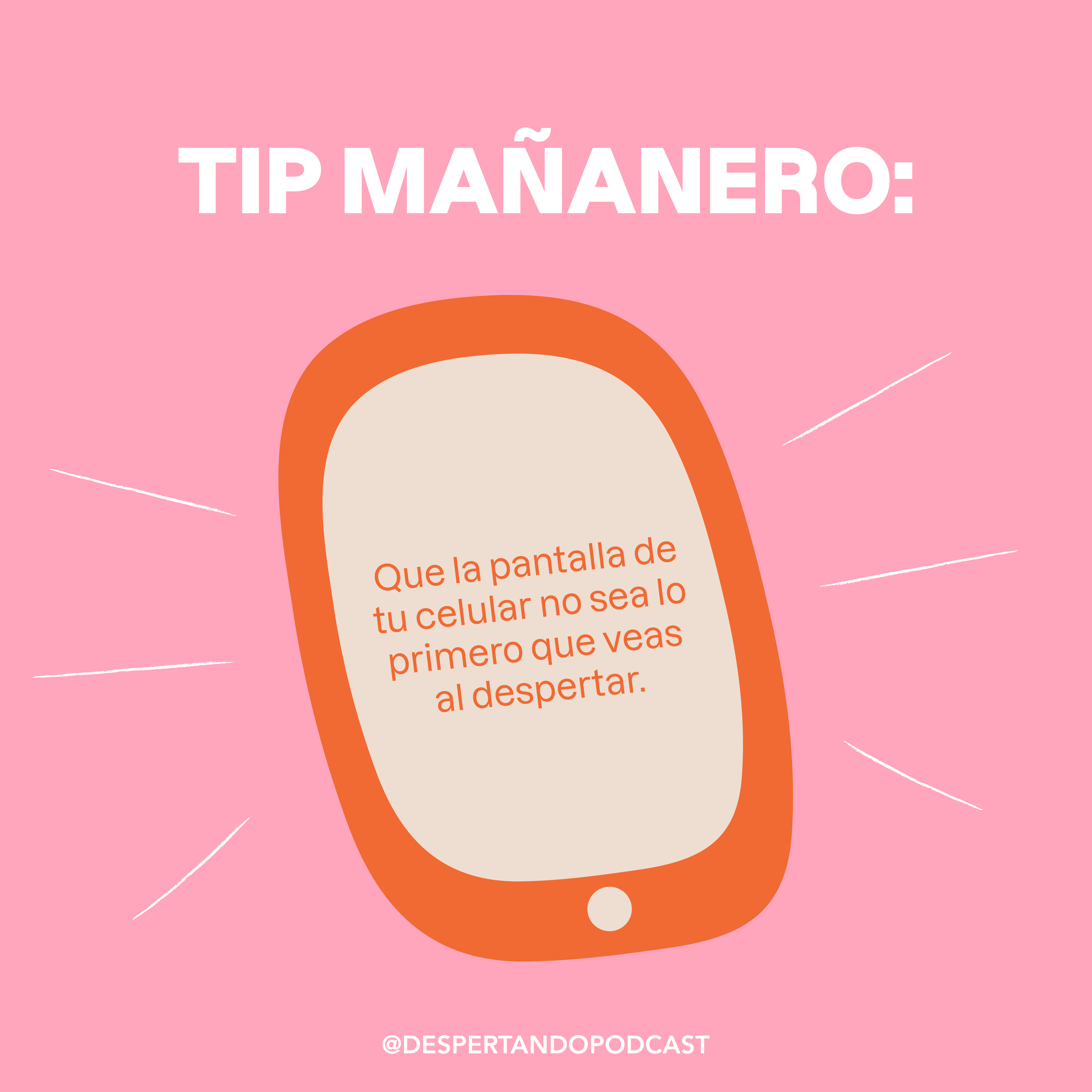
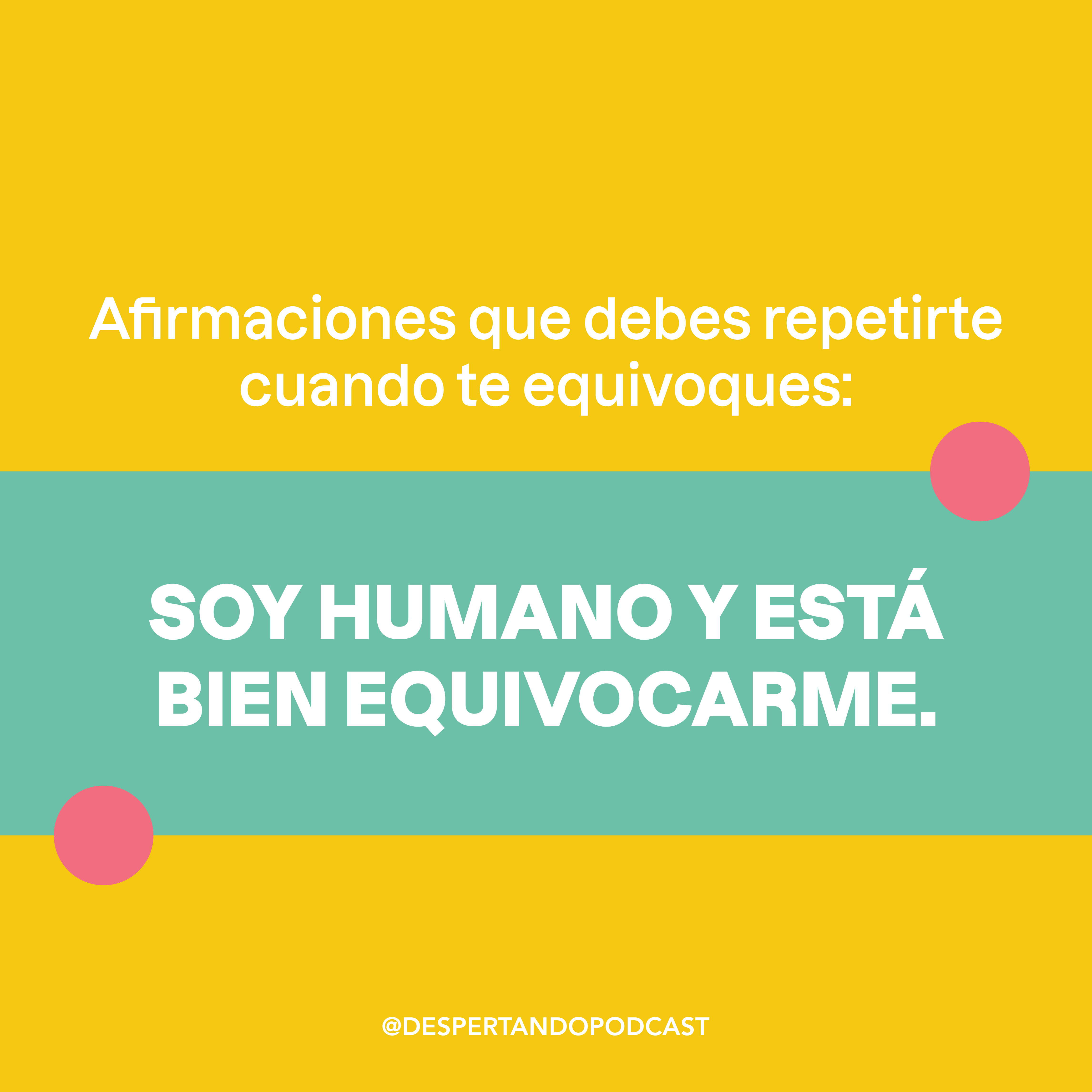
Despertando is a daily 5 min podcast, produced by Dudas Media and created by Lety Sahagún and Ashley Frangie. This podcast helps you set a purpose for every day, helping you live a more conscious life. For this podcast, it was important to trasmit a positive attitude towards starting the day, so we created an identity that was vibrant, energetic and friendly. (Instagram posts, stories, reels)
This was a collaborative work. The logo was designed by Brianda Dávalos. I was in charge of the rest of the Branding.![]()
Instagram Feed (selected posts)


Youtube channel

Instagram Stories

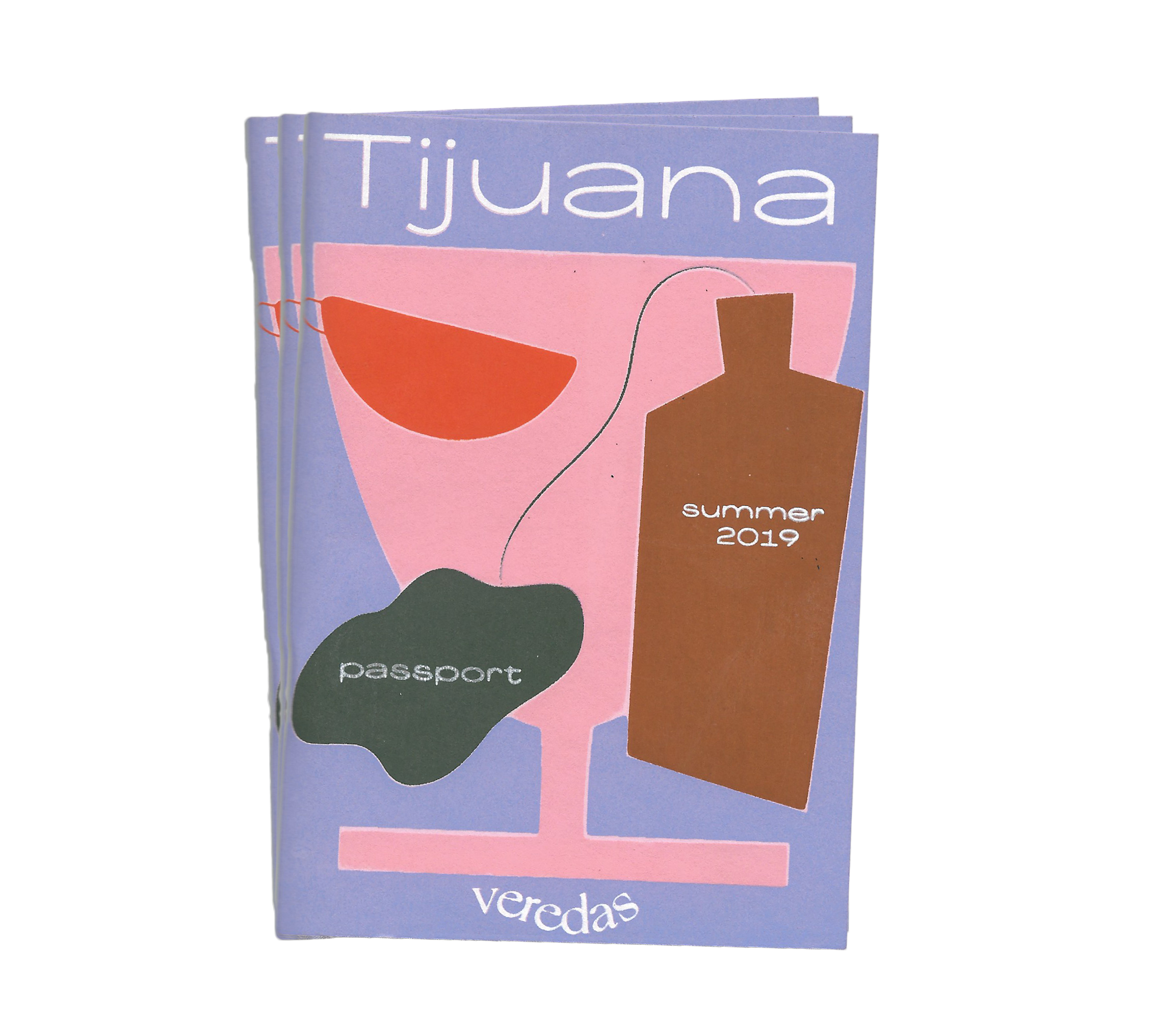
VEREDAS
Veredas is a promotional pocket guide where
people can
get special offers
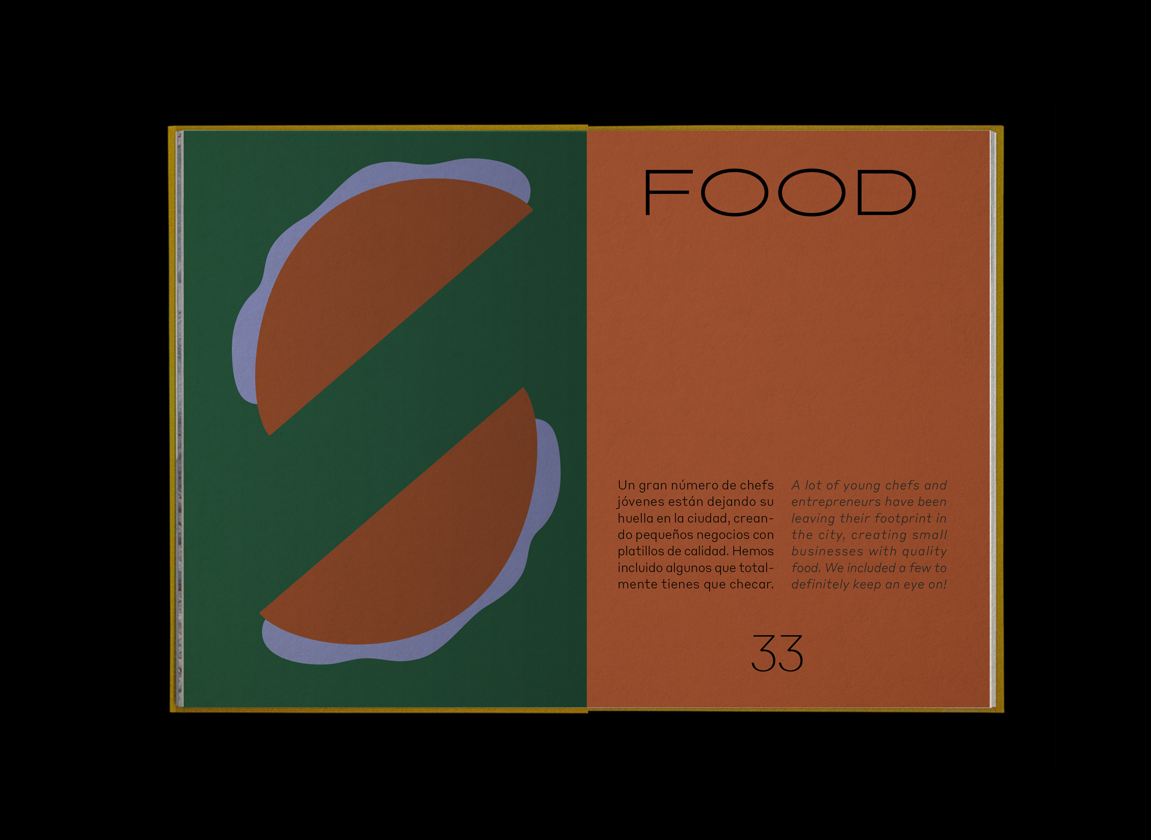
of some of the new gastronomic proposals of Tijuana. I collaborated with my brother, Carlos Olvera. He handled the logistics and I worked on the design. (identity, book design, illustrations, social media)
Tijuana is constantly growing in every sense and it’s attracting people from all over the world. We wanted to be that friendly voice that welcomes you to our city.
Veredas is meant to give a welcoming vibe. That’s the reason the colors are vibrant, the typography is bold, the copyright has a friendly tone, it’s bilingual and the illustrations are simple and easy to understand.
![]()


The name “Veredas” means a path that is formed overtime with the passing of people. We thought it went accordingly to the project, since we are highlighting what Tijuanenses are doing and trying to invite people to follow along.
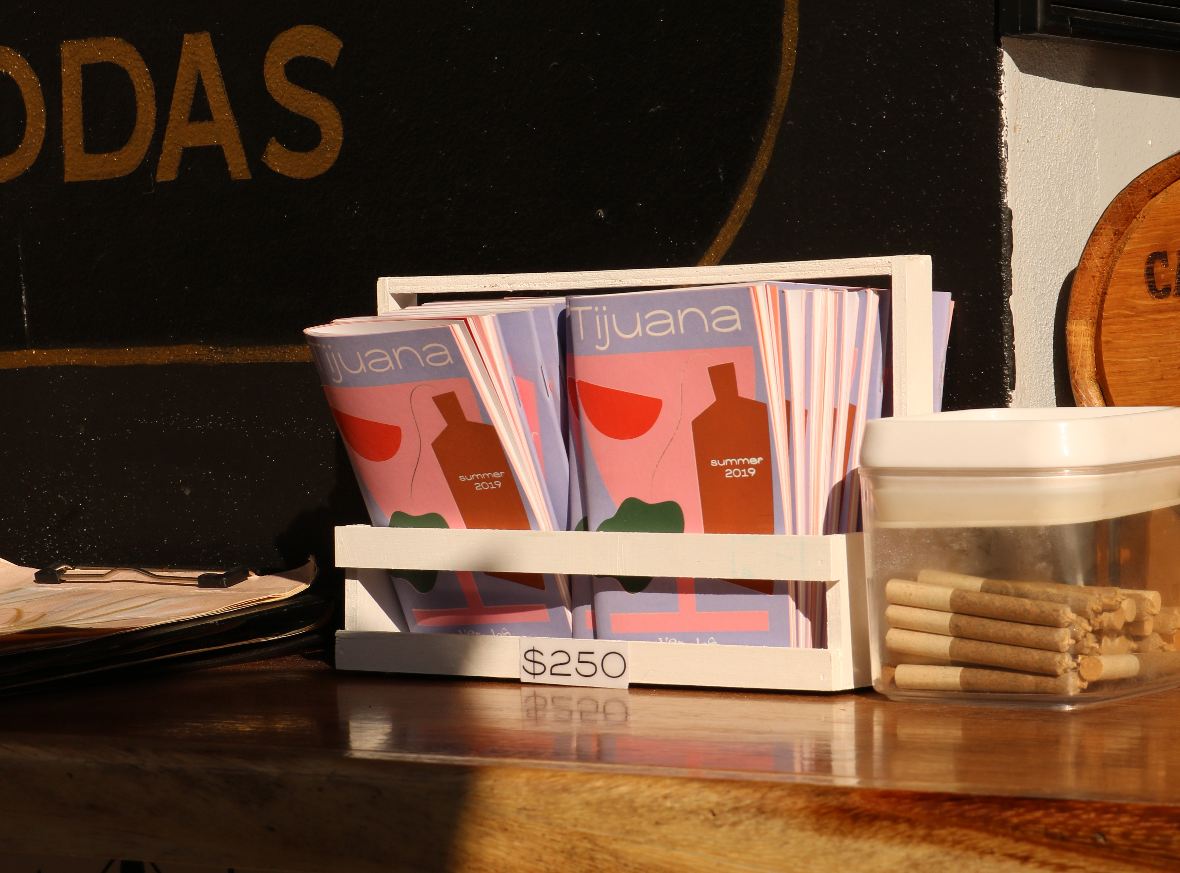
This first editions includes 21 places (craft beer, cocktails and food). The rules are simple: You choose the place you want to go and the place stamps your book, once you get the offer. This guidebook includes stories of the places, a map, comics and extra surprises.


This first edition is mainly editorial, but we also focused in social media.
![]()
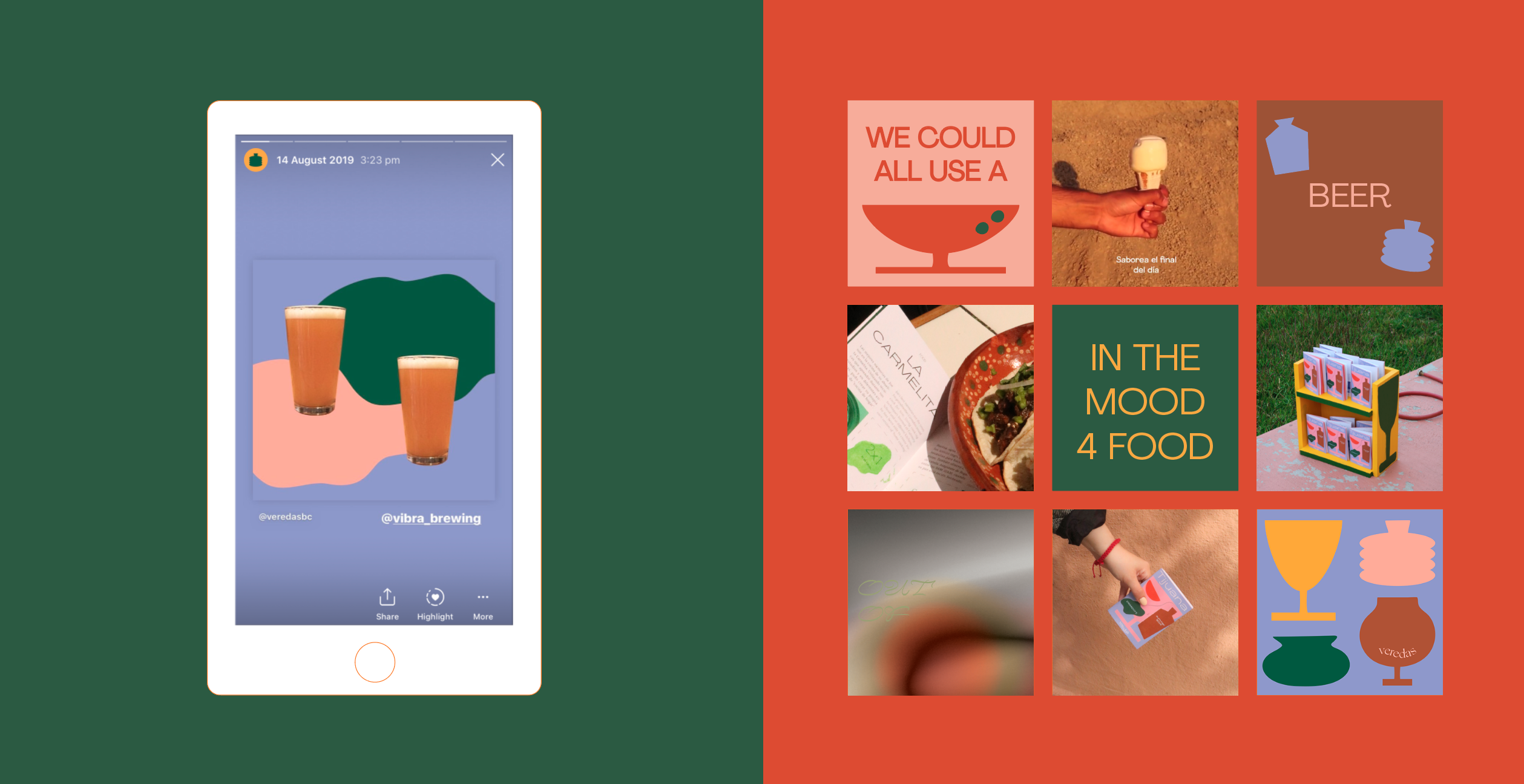


If you want to keep track of this project, follow us on instagram: @veredasbc